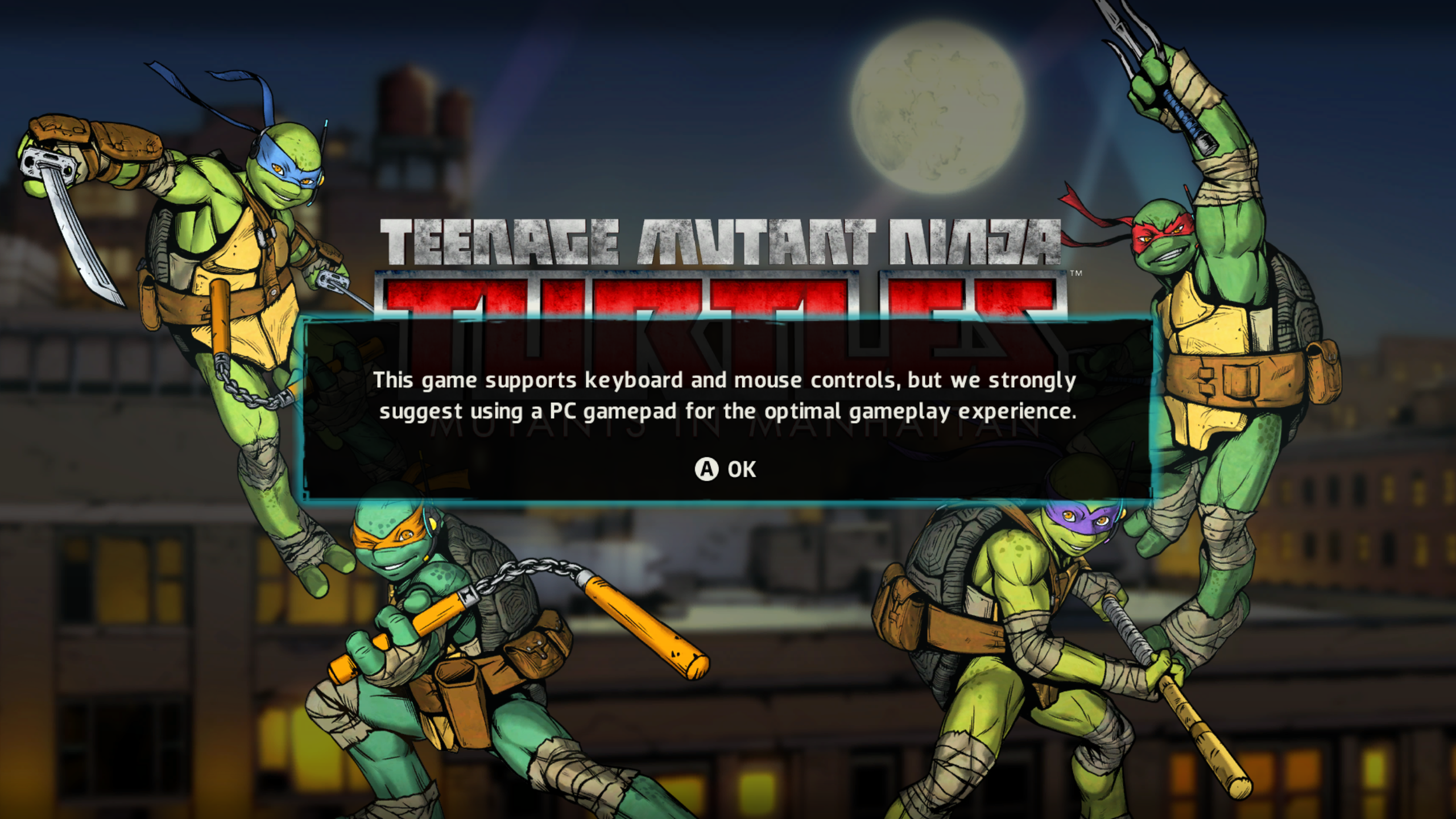
I didn’t want to believe the reviews (e.g., IGN, Gamespot); I really, really, didn’t. The nostalgia and desire for a good TMNT game was just too strong. However, I should have bitten the bullet and quit after the title screen:

From a usability/accessibility standpoint, this might be the worst possible opening message for a PC game. Luckily, I was able to play with a DS4 controller; otherwise, I wouldn’t have gotten the “optimal gameplay experience.”
Although this issue likely warrants no explanation, a PC game should be optimized for PC controls and controller support should be secondary (although it is a very welcomed accessibility feature). Turning on the game and seeing this screen makes me feel taken advantage of, because this message suggests that the PC version is not well-optimized and less time, money, effort, etc. was allocated to it. Moreover, this completely alienates anyone who plays on PC and does not own a controller from achieving the best possible experience playing this game. Ultimately, this limits accessibility to a game that should be available to a wide audience, ranging from young kids to adults who grew up with TMNT. Immediately, they know they are not playing the best version available, and this could ruin the experience from the outset.
The tutorial room
Another usability issue lies within the tutorial, which is an optional mode that teaches the player all of the necessary controls in a room separate from any in-game action. However, TMNT: Mutants in Manhattan has more than just a few controls to remember, making the tutorial room a less-than-ideal choice for this kind of game. While it’s not overly-complex, it has a surprising amount of controls, ranging from basic movement/combat, to item use, to turtle swapping, to commands, to distinct ninjitsu moves for each turtle. See below for a full playthrough of the tutorial.
A tutorial room that takes almost ten minutes to complete is not beneficial to players here because it is information overload, as there are multiple controls explained followed by gameplay executions for each. More importantly, it’s just plain boring and does not hold the player’s attention, making it even more likely to be skipped altogether, ultimately leaving the player even more confused when playing the actual game and unable to obtain the “optimal gameplay experience.”
Recommendations:
- Incorporate the tutorial into the first mission of story mode. This will help reduce the likelihood of the tutorial being skipped altogether.
- Exclude the redundant on-screen text during the tutorial, which is simultaneously being narrated by in-game characters (this requires the player to split his/her attention). Instead, integrate the textual explanations into gameplay diagrams/actions. This will allow the player to learn by doing while likely maintaining his/her focus. Additionally, it can reduce working memory overload for players with less prior knowledge, which likely make up a large percentage of the players for a game with such broad appeal.
- Break aspects of the tutorial into chunks and present them as they occur organically in the open world. This will require the player to remember less and produce less load on memory. Also, this segmenting will allow him/her to proceed at his/her own pace, granting him/her a greater feeling of control. Ultimately, this will likely lead to less player frustration and a better overall experience.
