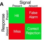
Signal Detection Theory (SDT) is a way to quantify decision-making in the presence of uncertainty, which is also referred to as internal and external “noise.” The basic premise of this theory is that both signal and noise are represented in calculated probabilities within the individual making the decision, and the extent to which those representations overlap can be quantified based on the individual’s response and whether the signal is present or absent (Anderson, 2015; although the specific mechanics and statistics underlying this quantification are beyond the scope of this post, there are a multitude of resources available for those interested in further pursuing that information). Therefore, there are four possible outcomes to the SDT (matrix from Anderson, 2015):

- Hits: correctly reporting the presence of the stimulus/cue
- Correct rejections: correctly reporting the absence of the stimulus/cue
- Misses: failing to report the presence of the stimulus/cue when it occurred
- False alarms: incorrectly reporting the presence of the stimulus/cue when it did not occur
Furthermore, the detection of a stimulus depends on both the intensity of the stimulus and the physical and psychological state of the individual. Recognition accuracy depends on whether a stimulus was actually presented, as well as the individual’s response.
In relation to games user research, the SDT can be used to measure and design many different aspects of games. Any instance in a game where a player has to make a decision under some uncertainty is when this theory can be best applied. Since SDT has been applied extensively in perception and decision-making research, let’s first discuss how some of this work is relevant to the player experience in video games.
Perception research commonly utilizes a behavioral task called the oculomotor delayed-response task, which requires an individual to make an eye movement to a cued location following a specific delay. The schematic of the oculomotor delayed-response task (from Goldman-Rakic, 1996) below should help demonstrate the connection between this task and video games.

For the oculomotor delayed-response task, during signal-absent trials, the individual has to hold off judgment until the whole observation period is finished whereas, during signal-present trials, the individual can judge the signal presence immediately after the signal is presented. Ultimately, researchers are typically interested in the number of trials an individual responded correctly and incorrectly (i.e., recognition accuracy). While the oculomotor delayed-response task has been manipulated in many ways (e.g., varying inter-trial intervals, cue/delay periods) to answer specific questions, perhaps its most relevant connection to video games is when players learn the meaning of a stimulus/cue presented in a game and then, at a later time point, need to respond appropriately about whether that stimulus/cue is present or not, as well as how to apply the information conveyed by that stimulus/cue in the current situation. Although players’ recognition accuracy of specific game elements is not being tested or predicted when they play games (unless, perhaps, they are playtesting), the relevance to the oculomotor delayed-response task and how it tests decision-making and working memory is evident.
Let’s look at some examples in games that might fit the four possible outcomes of the SDT:
Hit

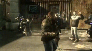
In Prototype 2, a third-person action game, instructional text is introduced to the player about the effect of their actions on specific UI elements. This appears near the relevant UI, which allows the player to easily associate this with the specific UI, and flashes briefly to attract the player’s attention. Additionally, there is time manipulation, which minimizes in-game distractions and allows the player to focus on the conveyance. Ultimately, this type of UI introduction is likely to result in a hit, according to the SDT, because it is a very attention-seeking design that minimizes extraneous distractions, or external noise.
Miss

In Battleborn, the tutorial starts once the player takes control of the character. White text is presented in the top-center of the screen, which explains features of the UI (e.g., minimap) as well as basic movement (i.e., sprint). However, since this text is small and cycles quickly, there is a high chance the player will miss this information. In addition, there is new objective text, character/story narrative, subtitles, and upgrade available notification. All of this presented simultaneously is cognitive overload for the player, who is also trying to experience the world and art style of the game at the same time. Ultimately, the low salience of the white text, in combination with higher-salient cues, is likely to cause the player to miss some, if not all, of what the white text is trying to convey.
Correct rejection
While correct rejections and false alarms can seemingly be more difficult to design around than hits and misses, a correct rejection would simply be the player correctly identifying the absence of a UI element. Designing for a correct rejection would likely be successful when implementing common UI industry-best practices, such as Neilsen Norman Group’s 10 Usability Heuristics for User Interface Design.

Infamous: Second Son introduces instructional text to the player describing one of the game’s main UI elements, the smoke meter, which is accompanied by a bright arrow that points to it. Also, in the GIF above, you can see the “Drain Shard” UI that appears when the player is in the appropriate position to complete such an action. Being that video games are only becoming increasingly more complex, with many things typically appearing on-screen simultaneously, it is important to note how the “Drain Shard” UI is noticeably different from other UI elements and notifications. It differs in size, color, and iconography. This and similar designs would likely result in correct rejections, according to the SDT, because the player would be able to easily notice the difference in the UI, not mistaking the “Drain Shard”, which is an in-game action, with another UI tutorial/notification.
False alarm
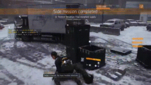
Continuing with the theme of video games becoming increasingly complex and containing numerous on-screen cues to attend to simultaneously, a busy screen is likely to result in some false alarms. Overall, The Division is an example of a game that handles the busy-UI screen relatively well by relying, primarily, on pop-up text boxes and a lot of flashing orange to convey information to the player. However, one example that might produce a false alarm can be seen below.

During the tutorial, there is almost continuous tutorial text appearing on the left-side of the screen. Specifically, the constant orange blinking and similar text-box pop ups could result in the player attending to a certain cue expecting one thing and it is actually an entirely different message. Although consistency in game elements is typically praised, when all UI elements are of similar design, this might result in the player thinking a certain UI element represents one thing when it actually represents something else entirely.
Conclusion
Although this post focused primarily on the external noise component of the SDT, it is important to note that the internal noise component (i.e., how external aspects of the SDT affect players cognitively) is an integral part of the theory. The internal response is an internal state that produces an individual’s impression about whether a stimulus/cue is present, has shifted, or is absent. Also, these components of the SDT typically fluctuate from individual to individual and situation to situation (Imai & Tsuji, 2004; Kubovy, Epstein, & Gepshtein, 2013); numerous variables can factor into this fluctuation, such as current psychological state, cognitive (e.g., attentional) resources, and prior experience with the type of game, to name a few.
How a player perceives game elements, as well as how he/she converts this information into an in-game action, is a complex process and, consequently, game design can affect a lot about the player experience from both psychological and physiological perspectives. As games user research grows as a field and begins implementing additional biometric methods, such as electroencephalography (EEG) to measure local brain activity, we will be able to correlate external and internal components of the SDT during gaming experiences. Although this will likely not be implemented for quite some time, and it will take time for basic research to accumulate enough evidence to convince companies to invest in such methods, understanding the intersection of these components could help inform game design. More specifically, this could help deliver designers’ precise intentions and, ultimately, an optimal player experience.
References:
Anderson, N. D. (2015). Teaching signal detection theory with pseudoscience. Front. Psychol. 6:762. doi: 10.3389/fpsyg.2015.00762
Goldman-Rakic, P. S. (1996). “The prefrontal landscape: implications of functional architecture for understanding human mentation and the central executive,” in The Prefrontal Cortex: Executive and Cognitive Functions, eds A. C. Roberts, T. W. Robbins and L. Weiskrantz (Oxford: Oxford University Press), 87–102.
Imai, A. & Tsuji, K. (2004). Event-related potential correlates of judgment categories and detection sensitivity in a visual detection task. Vision Research, 44, 763-773.
Kubovy, M., Epstein, W., & Gepshtein, S. (2013). Foundations of visual perception. In A. F. Healy & R. W. Proctor (Eds.), Experimental Psychology. Volume 4 in I. B. Weiner (Editor-in-Chief) Handbook of psychology (87-119). New York, NY: John Wiley & Sons.
