This post will look at some issues with inventory management in Horizon Zero Dawn. It is not a comprehensive review of the UI or the game overall, rather a focused analysis of the “Inventory” tab and some pain points encountered during my playthrough.
General navigation and usability of “Inventory” and “Resources” tabs cumbersome
Horizon Zero Dawn allows players to pursue a few different paths when it comes to assigning skill points on the skill tree. Being a player who prefers not running out of necessary items for crafting, I initially invested in perks that allowed me to gather more resources from loot drops. Although I was constantly using many of the items, I quickly filled my inventory (resources are capped at 100) and was routinely looking to remove/drop things when finding newly-dropped items. Anyone who has ever played a RPG knows the feeling of a full inventory, but Horizon Zero Dawn makes dealing with this a chore.
Upon first opening the “Inventory” tab, the player is presented with a grid-style layout. While all sections of the inventory have this layout, the burden of manageability is especially apparent in the “Resources” tab due to the high capacity. Visually, the iconography does not do a great job of differentiating the many items on screen. Although there is color added to some of the icons on other tabs, the resources tab only has rarity-based coloring, which does not help the player to quickly identify items at a glance.
Another reason the “Resources” tab can become overbearing when the player has many items is because items cap at arbitrary numbers. For example, the first seven items seen in the screenshot below (Sparker) are all the same, but once the player collects 100 of that item, a new inventory spot must be used. Also, there is no consistency in this numbering system, as players can obtain 100 Sparker before needing to use another inventory spot, whereas meat can cap at 25 before needing another spot.
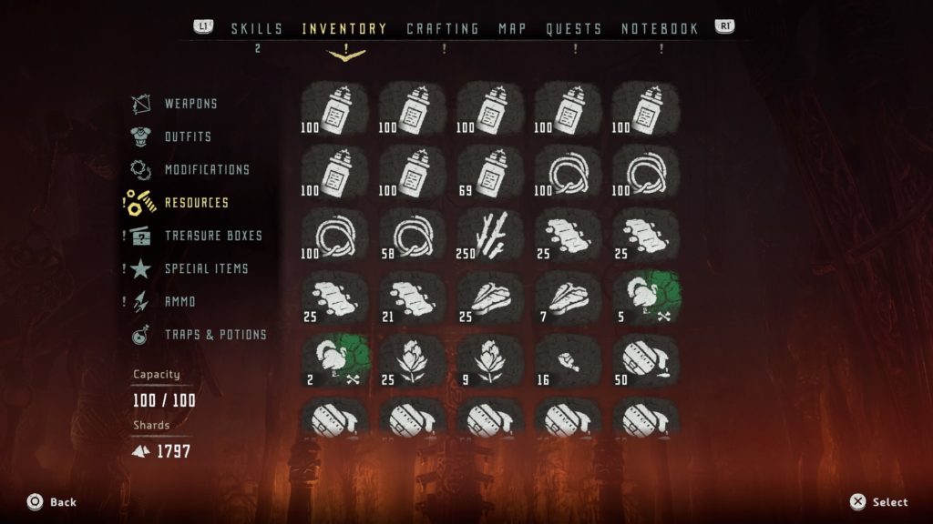
Furthermore, when dropping items (holding triangle), there is no option to drop a partial amount of these arbitrary numbers. If the player wants to open an inventory spot by dropping (or selling) one of the seven spots occupied by Sparker, all 100 would need to be dropped. Allowing players to drop a specific amount would have allowed for more precise and customized inventory management.
Lastly, there are no filtering options to expedite the process. Players need to manually cycle through all 100 items (if full) to find an item they deem expendable. Being able to sort and filter by different categories of items, rarities, etc. would have been very useful. Alternatively, having the “Resources” tab broken into more specific categories rather than just lumping everything under one tab have made navigation and management more fluid.
Lack of further information about resources
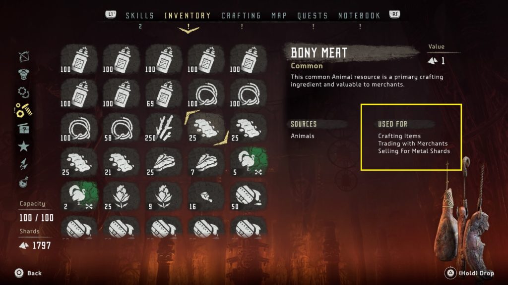
Upon further exploration of the items in the inventory, information about the use of each item is presented on the right side of the screen under “Used For.” The issue here is that this information offers very little help to players, primarily because many items in the game have multiple uses listed and there is no way to find more relevant information from here. Therefore, the player might be on the fence about selling an item that is listed as “Selling for Metal Shards” because it also has a listed use for “Crafting Items.” This lack of information severely limits important decision making for players. Also, this can cause a snowball effect, which starts with a fear of parting with any items because they might be needed later in the game to craft or trade with a merchant to get something specific. There is nothing like hoarding items in RPGs, parting with some at some later point, then ultimately realizing it’s needed for something else you want.
For example, in the screenshot below, ‘Bony Meat’ has multiple uses in the game (i.e., crafting items, trading with merchants, selling for metal shards). Important information to include here (or ways to navigate to) to inform decision making would be:
- What item(s) can be crafted with bony meat?
- What can bony meat be traded with merchants for?
- How many metal shards can be obtained by selling bony meat?
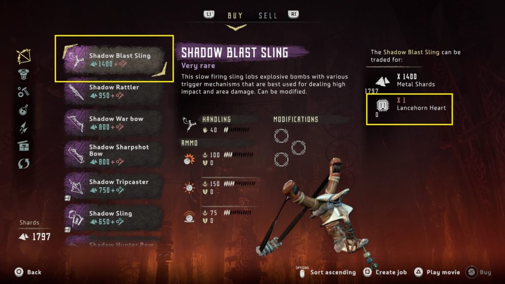
“Create job” does not perform as expected
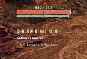
Horizon Zero Dawn has a mechanic that allows the player to create a job to find crafting items or items they might need to complete trades with merchants. While this is a great addition to help players track items, it does not perform as expected. As seen the in screenshot below, players can press square on an item to “Create job” and actively track the missing required items, which is a “Lancehorn Heart” in this instance.
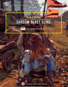
Once a job is created by the player, he/she is given the option to make it their active quest. Everything about this “New Errand” behaves like a quest, minus one major component – the determining of the location of the tracked items. The “Create job” mechanic basically gives players an on-screen checklist for items they need to find and nothing more. Without any additional information here, such as a waypoint set to a general area of the map, players can spend a lot of time roaming around for animal parts, for example, which are not indicated on areas of the map like robots, and are needed to craft many different items. If this omission is by design, perhaps to encourage random exploration, and the intent is to be a glorified checklist, great. If not, this seems like a missed opportunity for a potentially super-useful mechanic.
Additionally, there are some issues present when trying to conduct business with Merchants:
Lack of clarity when an item cannot be sold
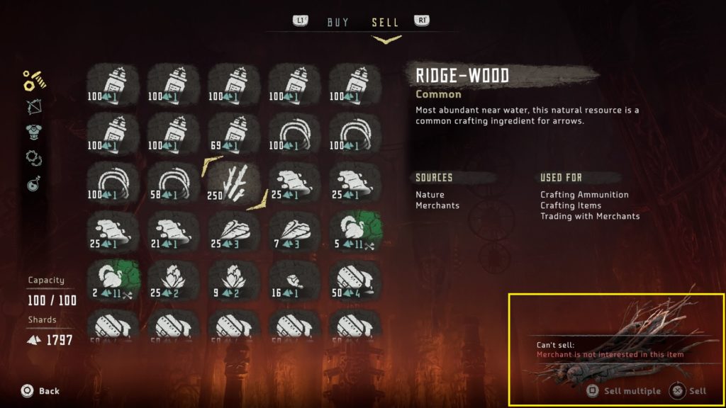
Below is a screenshot of the main UI when selling items to merchants. The “Resources” tab is similar to that discussed earlier in the “Inventory” tab. The item selected in the screen below, Ridge-wood, is a very common item in Horizon Zero Dawn used to craft arrows. It appears, just like every other item in Aloy’s inventory, when navigating the “Sell” tab. However, it cannot be sold to merchants and the only information conveying this is in the bottom-right corner, where “Sell multiple” and “Sell” are dimmed/grayed out. If the player attempts to sell it by holding X, the “Can’t sell” prompt seen in the bottom right appears. Neither of these are very clear; the dimming of the text is too subtle to be recognized and, along with the “Can’t sell” prompt when it appears, is on the opposite side of the screen away from the player’s main gaze. This important information can be easily missed. A better way to convey the “Can’t sell” information would have been directly on the items themselves, where the player is directing their attention.
Lack of clarity when an item cannot be bought due to full inventory
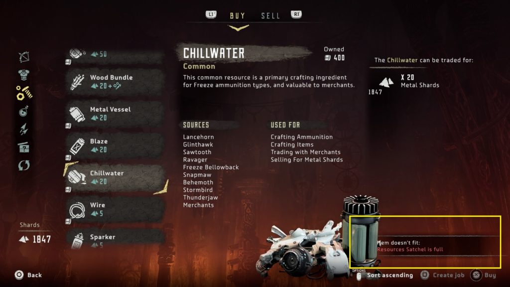
Similar to the previous issue, when navigating the “Buy” tab and attempting to buy an item when having a full inventory, the “Item doesn’t fit” prompt appears on the opposite side of the screen from the player’s main gaze. Additionally, this prompt overlaps some of the item art, which can make it harder to read.
Inconsistency with sorting options
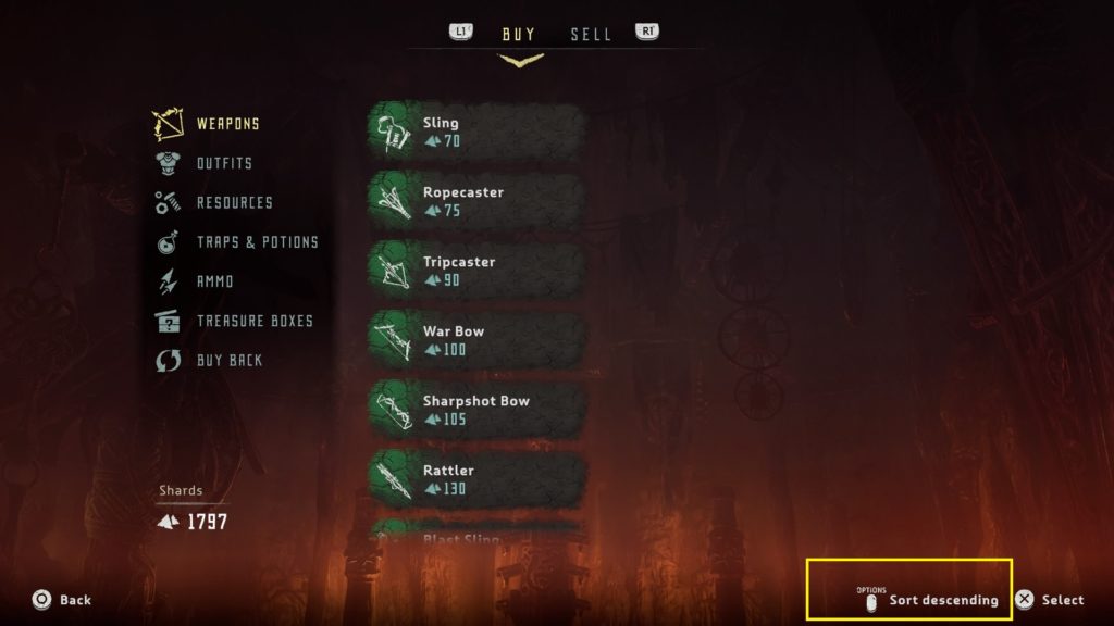
When navigating the “Buy” tab, there is the option to sort by ascending/descending item value. However, this option is not included under the “Sell” tab, adding to the list of inconsistencies within the inventory management system.
Important player-facing information cut off
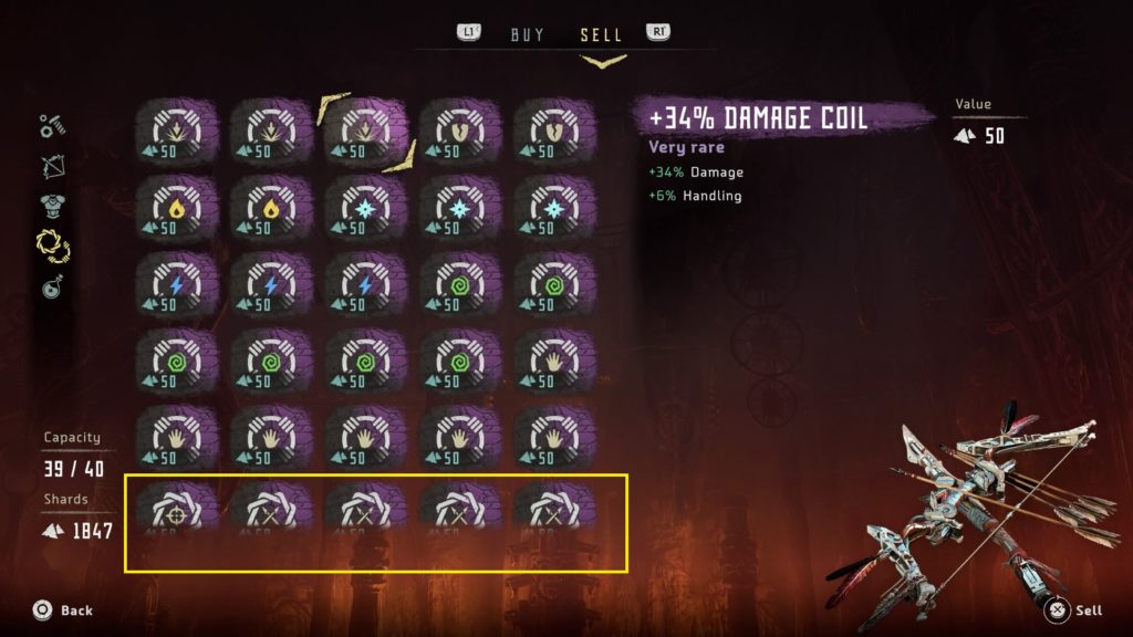
Although minor, one thing that is consistent across both “Buy” and “Sell” tabs (and the inventory in general) is that the bottom-most visible row is cut off, often omitting important information and requiring the player to scroll. For example, in the screenshot below, the value of the modification is cut off.
Buying back items is unclear
Players have the option to buy back items that have been sold to merchants. Although this sounds straight forward (i.e., player sells, can buy item back), it is not. Merchants only keep the ten most-recently sold items in their inventory at any one time. Additionally, players cannot buy back any items of common rarity, only green (uncommon), blue (rare), and purple (very rare). If a player goes on a selling spree not realizing this, the player will not have the option to alleviate any potential feelings of seller’s remorse.
This is a fine system; I’m not advocating for players to have the option, at the end of the game, to buy back the very first option he/she sold. However, there is critical information here that needs to be conveyed, perhaps upon the player’s first visit to a merchant via a small tutorial or prompt.
Conclusion
Horizon Zero Dawn is a good game that does many things well, such as numerous open-world tropes, combat, and telling an entertaining story; however, inventory management is not of of those things. Although I likely spent as much time fumbling through the inventory as I did combating robots, Horizon Zero Dawn is worth checking out if you’re a fan of action RPGs.
