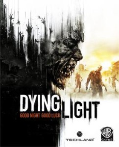
Dying Light was easily one of my favorite games of 2015. With the new DLC, The Following, and the Enhanced Edition recently being released, I figured it was the perfect time to dive back into Harran. Now about 10 hours in, I figured I would share The Following (sorry, I had to) initial thoughts on usability and user experience.
HUD appears when relevant
This is a nice feature that doesn’t seem to be all that common in games; the HUD appears as it is used/explained. For example, during the prologue, the health bar in the upper left-hand corner appeared as the player is directed to pick up a crowbar, which was a solid secondary indicator that a combat scenario was looming. This simple feature keeps from unnecessary UI clutter in the beginning and lets more of the game be taken in from the outset, ultimately resulting in better immersion.
Directional reticle to show height/depth
From a design perspective, the sense of scale in Harran is one of the most impressive aspects of Dying Light. It is exhilarating to reach the top of the tower, for example, and overlook Harran while hearing and feeling the wind blowing you around. With such scale, the inclusion of a directional reticle that shows height and depth of objects on the map is incredibly useful; it saves a lot of time that would otherwise be spent wandering areas around the current destination. This is EXACTLY what was needed in Far Cry 3: Blood Dragon to avoid turning jeeps into water rafts.
Productive loading screens
This isn’t exactly mind-blowing in terms of novelty, but, at least to me, productive load screens are always a welcomed addition. Dying Light provides a quick recap, both verbally and through text, of your current objective, which is a nice way to get the player re-immersed in the world prior to diving back in and prevents the need to fumble through menus to figure out where you left off last.
Poorly-timed directional pop ups
However, one demerit for usability can be attributed to poorly-timed directional pop ups. During the free-running tutorial portion of the prologue, there is a section where the player must jump from one piece of scaffolding to another. It is a fairly sizable gap, so I took it upon myself to get a running start; however, I’m not sure Techland anticipated players taking this (incredibly logical) approach to clearing the gap. As the main character, Kyle Crane, was midair between the two scaffolding, a pop up informs the player that the jump button must be held throughout the jump. By this point, the jump button has already been released, which results in a very unfortunate plummet to death for Crane (where are those piles of trash when you really need them?). While this issue only occurred this one time, it could have been easily rectified by changing the timing of the pop up.
Conclusion
As I said, Dying Light was easily one of my favorite games of last year. Although the story leaves something to be desired, the gameplay is incredibly engrossing. Especially because, at the beginning, you feel like a pathetic wimp who easily becomes overwhelmed when encountering anything more than one biter; however, the sense of progression is very much clear through the gameplay, as you feel progressively more powerful with each upgrade, which makes revisiting familiar as well as new (e.g., being daring enough to take on Volatiles at night) situations an absolute blast.
While I’m not advocating making games easier, I try to take into account issues someone who has never played a similar game might run in to. Dying Light, similar to loads of other games, has many examples where it leaves you to figure things out, such as basic character movement and combat. While most games are tailored to target specific audiences and typically expect a certain level of prior knowledge, the topic of “hand-holding” in games versus deliberate usability/user experience design is an exciting one I will visit in the future.
I will update this post as I progress through Harran and play through The Following – so stay tuned! In the meantime, check out another nice usability feature in Dying Light. Until then, remember, kids, all you need to survive the apocalypse is some gauze and alcohol (not necessarily in that order).
