A competitive analysis is an evaluation companies use to to see what similar companies are doing with their products in order to figure out how they can make their product unique and marketable. In games user research, a competitive analysis can be a useful internal tool to help inform game design and different features during many stages of development.
An example:
Company X has been running many internal and external playtests of their current in-development game. They have been noticing a consistent trend of players not realizing when an objective has been updated, completed, and transitioned to a new one. The design team believes this might be an issue with the new objective UI, so a competitive analysis is conducted to see how other games have handled such UI design. This can help give the development team ideas about UI that have worked and not worked for other games, and how they can design theirs to be functional, effective, and consistent with the art direction of the new game. The following are some examples of new objective UI in games that could be presented to the development team for consideration.
Borderlands 2
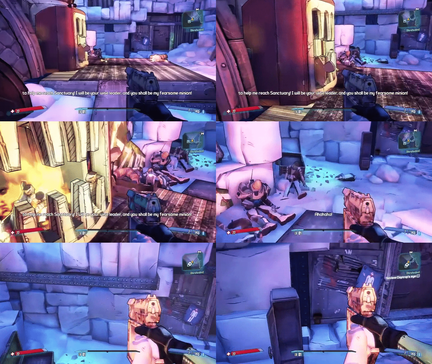
When the player obtains a new objective, the objective text/check box slides onto the upper-right portion of the screen, briefly flashing, and remains under the mini-map.
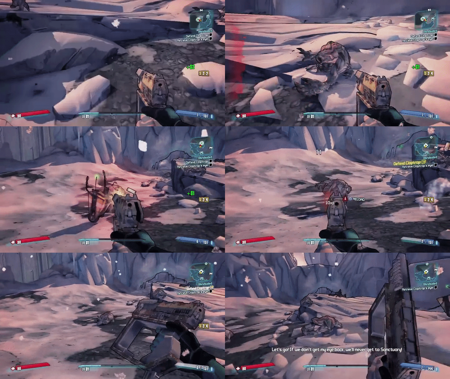
As objectives are completed, they get checked off, flash, and exit the screen.
Sniper Elite III
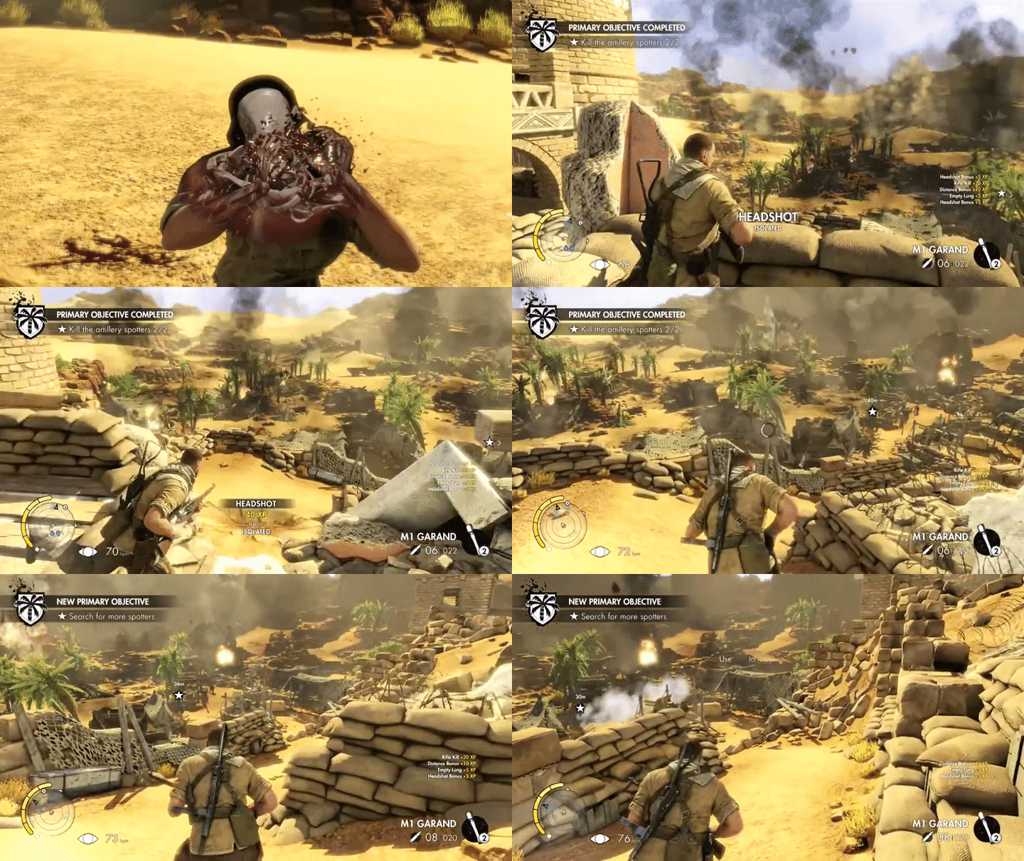
Completed and new objectives are indicated by text that appears in the top-left portion of the screen.
The Witcher 3: Wild Hunt
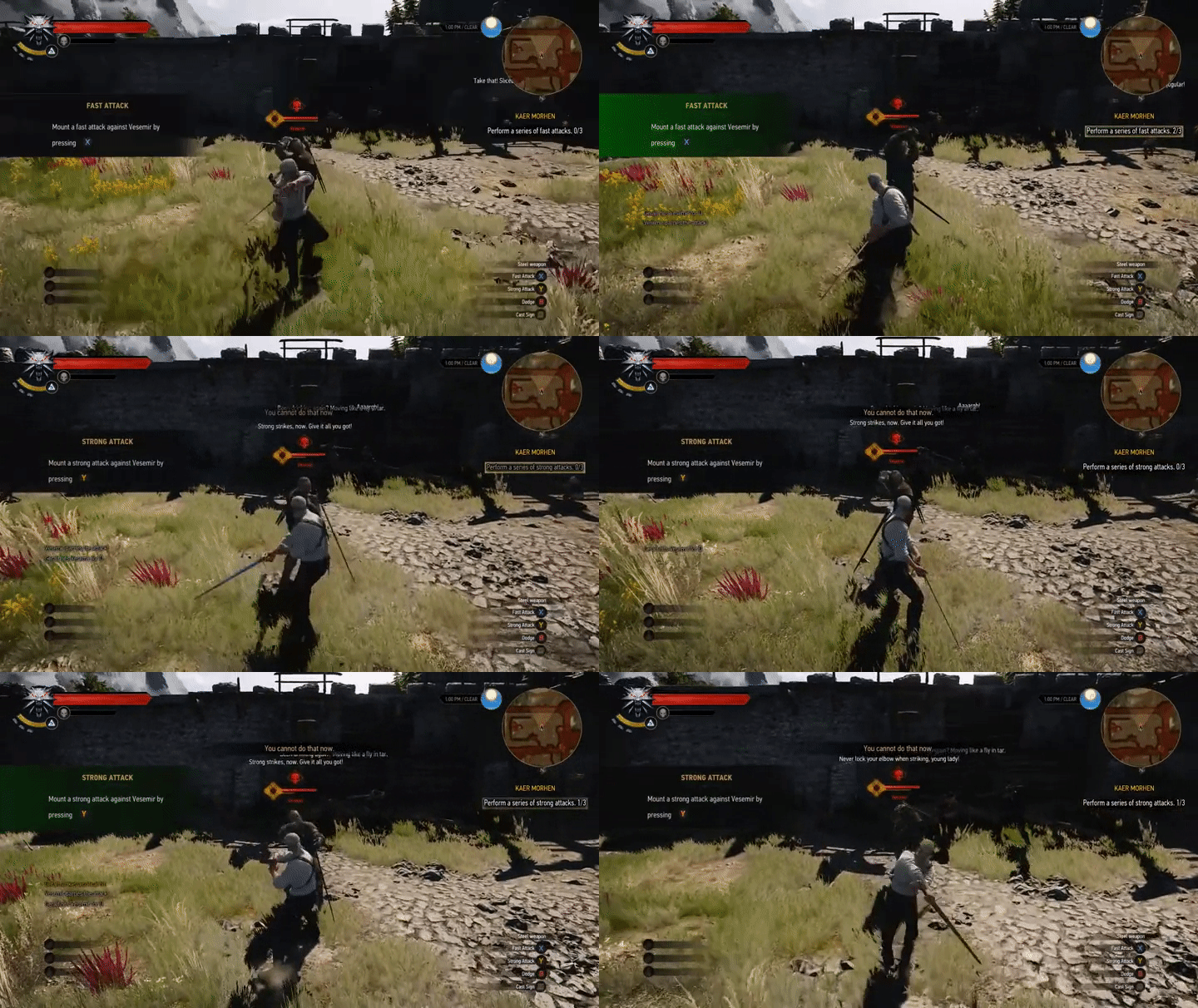
Under the mini-map, the objective is updated as the player completes required portions of the main objective. Relevant text/numbers are updated and the text is highlighted as a cue to the player.
Diablo 3
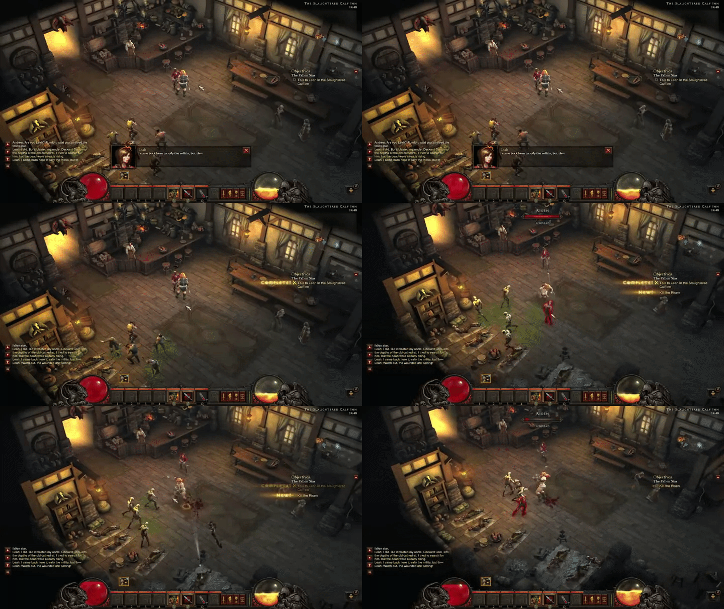
Objectives, on the right side of the screen, are updated with a check and a yellow “complete” and “new,” which act as visual cues to notify the player and then fade from the screen.
Middle Earth: Shadow of Mordor
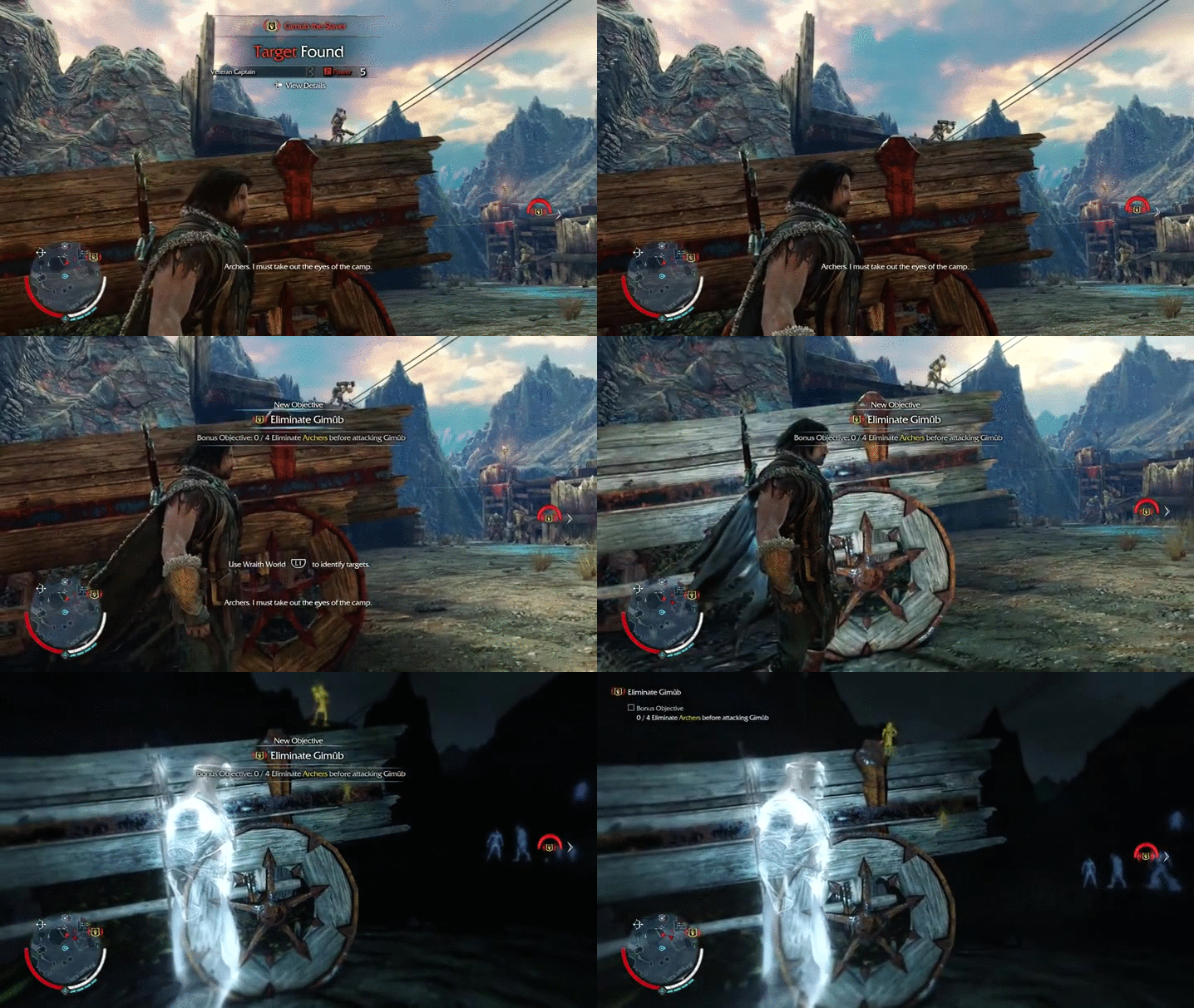
New objective text indicator appears in the center of the screen momentarily before trailing off to the upper-left corner of the screen as a reference for the player.
Conclusion
A report for the development team can be generated, which would include descriptions of the the game-specific features and critical comparisons between the games. Additionally, suggestions for potential directions may be included in the report; however, this would depend on the philosophy of the research department and development team.
This is just one example of a competitive analysis for games user research. Others might include investigating how different games handle blood spatter, damage indicators, or tutorials. A vast knowledge of games is undoubtedly beneficial for such analyses; however, in this digital age with access to YouTube at all times, it is certainly possible to conduct such analyses with little prior knowledge of such specific aspects of different games.
