The Division is a game that needs no introduction considering how popular it is and how many sales records it has broken. It seems like just yesterday that I was picking my jaw up off the ground following Ubisoft’s gameplay reveal at E3 2013 . Seeing the agent avoid the bullet-stricken NYPD car window and close the car door on his way to safer cover was just one of those “wow” moments. Played on PC (with a controller), here are my thoughts on usability and the overall experience:
Usability:
A-B-C, easy as 1-2-3?
Many games (e.g. Gears of War) have used a very similar third-person-shooter cover system to the one utilized in The Division. Typically, “A” is used to get into cover, as well as to move around and over. In The Division, using the reticle, the player can look where he wants to run into cover and “A” can be seen popping onto the screen for every spot the player can use. As a game with a lot going on on the screen at any one time, both UI- and notification-wise, the “A” popping up everywhere can easily misdirect the player’s attention elsewhere on the screen, perhaps thinking it is loot or that a mission-oriented task needs to be performed. Thankfully, this feature can be disabled in the settings menu.
The main difference in this cover system compared to other third-person shooter cover mechanics is that, to go over an object or climb up/down something, “B” is used. See the screenshot below.
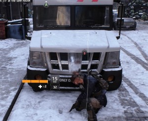
However, there are some inconsistencies with this system, primarily with dropping down from something. Sometimes, pressing B is required to drop down, whereas other times simply moving your character in the direction you want to drop suffices. It is never made clear when to press B versus not other than “B” appearing on the screen. If you’re high enough, there is an indicator along with the B that notifies you that you’ll lose some health from the fall. Is the necessity to press B versus not dependent on height? Unclear.
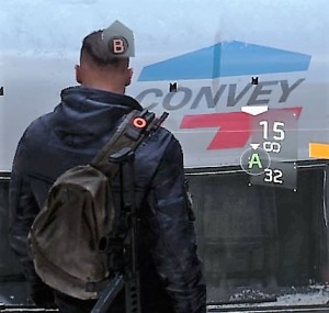
Another inconsistency with this system can be seen in the screenshot above. Additional arrow indicators can send mixed signals to players, which could lead to some confusion. It is pretty clear that the B here informs the player how to climb to the top of the truck; however, does the A indicate that the player can take cover against the window or drop down from the truck? This is a system that took a few minutes to practice, since it essentially complicated an already established simplistic system of using one button to perform multiple cover- and traversal-related actions. While it’s possible that Ubisoft implemented this to appeal to an audience that doesn’t have a lot of experience with third-person cover systems, the constant visual cues makes the player wonder if a “less is more” approach would have been more beneficial here. Again, once the subtleties of this system are controlled, it can be helpful to to turn the cues off.
Poorly-timed explanations or just none at all
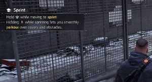
As mentioned, The Division can have a lot happening on the screen at any given moment and, although there is a fairly lengthy prologue that covers the majority of the tutorials and essential info, there are explanations for some aspects of the game that are either awkwardly timed or nonexistent. There are numerous occasions where an informative pop up was presented on screen, either explaining a basic gameplay mechanic or feature. For example, after completing the prologue Precinct Siege mission (and sprinting a multitude of times throughout), the player is informed how to make his agent sprint. Another example came after the second story mission where the player is tasked with rescuing Dr. Kandel; here, your agent’s primary attributes (i.e., stamina, firearms, and electronics) were explained. Knowledge of these attributes is essential to proper character building and presenting its tutorial at an ill-advised time does not provide it the attention it needs; players might deem it immediately irrelevant to them and quickly dismiss it.
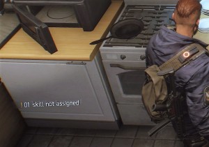
While awkwardly-timed tutorials can throw a wrench in the experience, not explaining important features can be far worse. One feature that is never fully explained are your agent’s skills, which are a very important aspect of gameplay, primarily how they compliment each other and are especially important later in the game against stronger enemies. The first indicator of skills is a notification that the player has a skill that is not assigned. However, there was no explanation of what these skills are, how they’re unlocked/achieved, or how to assign them.
Other features that were never explained include emotes and status effects. What is the point of emotes, why use them, and HOW are they used? Down on the d-pad is designated to numerous emotes, all of which can serve different purposes, such as helping communicate with team members or getting your agent some exercise (as if running around NYC wasn’t enough). There are visual indicators for status effects (i.e., bleed, burn, disoriented, blind-deaf, shock, and disrupt), however, their actual effect on gameplay is never clarified.
Missing loot
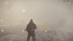
Briefly, the loot system is categorized into five different rarities: worn (white), standard (green), specialized (blue), superior (purple), and high-end (yellow). Loot dropped by enemies is signified by a sky-high beacon the color of the item’s rarity. However, being that the main ambiance of The Division is a snowy/smoky, post-apocalyptic NYC, it can be incredibly difficult to notice worn items, which include ammo, med kits, and some weapons to name a few, against the daytime and snowy sky. This issue is non-existent with the other rarities, simply because the contrast is much greater between those colors and the game environment.
Appeals/opinions
Features that enhance the experience
While The Division has some usability issues, it also contains some subtle features that help streamline tasks, such as navigating the menu, and improve the overall experience. One such feature is that, when visiting vendors, the game doesn’t give you the option to (accidentally) sell equipped guns/gear. With what seems to be a never-ending backpack full of loot, it is quite useful to not have to memorize everything you have equipped in order to not accidentally sell it. Anyone who has ever played an RPG has experienced that immediate sense of regret (quickly, reload last save!). Additionally, while navigating the world, the option to override the current object with a quest that is close in proximity by simply holding X is a nice way to change objectives on the fly and allows for better real-time “city randomness.”
Immersion – “open-world” as an umbrella term
As a huge fan of open-world RPGs, once the tutorial/prologue is completed and I’m unleashed into the open world, my first matter of business is randomly exploring in order to further immerse myself in the game world and experience this “randomness.” However, during my exploration of the first Manhattan district, there was an underwhelming amount of random loot and not nearly as much as one would expect from an “open-world” game. Additionally, sick citizens, requesting aid in the form of a med kit or can of soda, and groups of enemies were encountered. The sick citizens would drop loot, almost always in the form of clothing or a worn gun, whereas we can all deduce how the encounters with enemies concluded. Upon exploration of subsequent districts, it was the same scenario – a lack of random loot, some sick citizens and groups of enemies. This, for lack of a better word, “static” environment, filled with what seemed to be copy and pasted “random” events made NYC seem lifeless. I’m aware that this is post-apocalyptic NYC, and perhaps game series like Elder Scrolls, Fallout, and The Witcher have set the bar too high, or in a different direction altogether, but this hindered immersion. Even post-apocalyptic NYC would, arguably, have more life than most places pre-apocalypse. No curiosity or sense of wonder is induced by the world of The Division because what was around the next corner and “random” events were all completely predictable and, ultimately, curiosity was never rewarded.
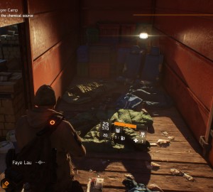
Lastly, let’s address the elephant in the room – graphically, it’s a beautiful game. While it might not have met the unworldly expectations set for itself during E3 2013 reveal, it has some of the best lighting and snow effects I have ever seen in a game. NYC looks great and, graphically, it is definitely a sight to see.
Final thoughts
I’m currently level 22 and have enjoyed the majority of my time with The Division. It is a game that does some things nicely, such as its RPG elements and shooting/combat mechanics. However, it is difficult to describe it as anything more than a blend of mechanics from older games of different genres and, unfortunately, these games typically execute said mechanics in a superior fashion. The Division, simply put, seems like an overly-ambitious game that spread itself too thin in order to appeal to a broad audience. You can’t revolutionize something without evolving an existing thing, which is where The Division ultimately falls short of its potential.
